


Why Professional Logo Design Matters for Architecture Firms
Logo design for architects is more than creating a pretty symbol - it's about building a foundation for your entire brand identity. Your logo is often the first impression potential clients have of your architectural firm, and research shows that design-driven companies outperform the S&P by 228% over ten years.
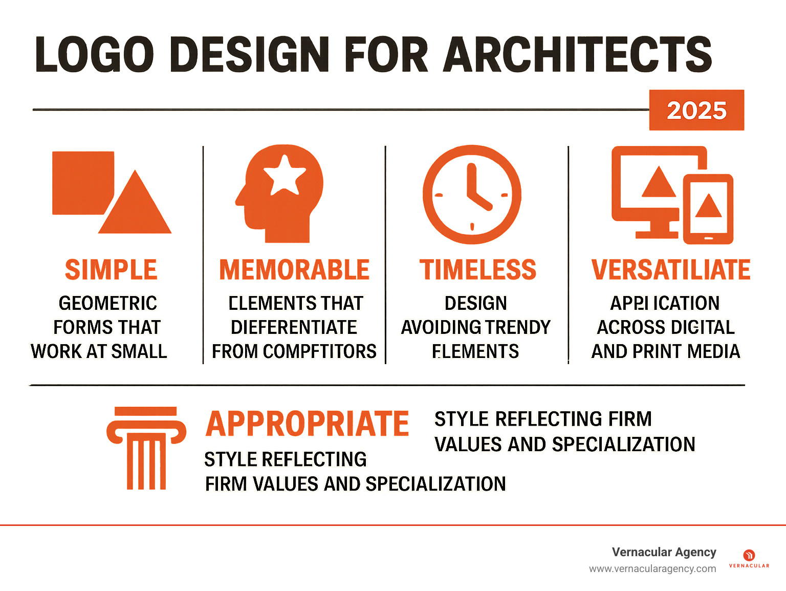
Essential elements for effective architect logo design:
- Simplicity - Clean, minimalistic designs that work at any size
- Memorability - Unique elements that stick in clients' minds
- Versatility - Works across business cards, websites, and building signage
- Professionalism - Conveys stability, precision, and expertise
- Relevance - Reflects your architectural specialization and values
Architecture is the product of innovation and artistry, and your logo should communicate both your aesthetic vision and professional credibility. Whether you're a residential specialist focusing on custom homes or a commercial firm designing skyscrapers, your logo needs to convey strength, stability, and sophistication to potential clients who expect robust construction and customized solutions.
The architecture sector often favors minimal wordmark logos, geometric shapes, and sophisticated color palettes like black, white, grey, and blue. These design choices aren't accidental - they communicate the precision, modernity, and trustworthiness that clients seek when choosing an architectural partner.
I'm Rebecca Falzano, Creative Director with nearly 15 years of experience guiding content creation and design for brands across various industries, including logo design for architects and professional service firms. My background in shelter magazine editing and collaborative design work has given me deep insight into how visual identity shapes client perception and business success.
Key terms for logo design for architects:
The Blueprint of a Strong Architect Logo
Your logo is the foundation of your brand identity, from which everything else is built. For potential clients, it's a visual handshake that communicates your firm's core values of stability, precision, and creativity at a glance.
The numbers support this: research from the Design Management Institute shows that design-driven companies outperform the S&P by 228% over ten years. This demonstrates that strong design translates to real business results.
A great logo becomes the visual shorthand for your firm, building brand awareness in a crowded marketplace. The key is to distill your firm's essence into a single, powerful visual that is both simple and memorable. Whether you specialize in sustainable homes or commercial spaces, your logo should hint at your unique approach.
Learn more about Vernacular Agency's Brand Identity services
Key Elements of a Successful Architecture Logo
When planning your logo design for architects, you can explore several styles, each telling a different story:
- Wordmarks use distinctive typography for your firm's name to build recognition—an excellent choice for new firms needing to establish their name.
- Lettermarks use initials or a monogram, which is effective for firms with long or complex names.
- Abstract marks use geometric shapes to represent your firm's values, while combination marks blend text with a symbol for the best of both worlds: name recognition and a memorable visual.
The building blocks of these logos often include geometric shapes (triangles, squares) to suggest precision and structure, and clean lines that echo blueprints and convey professionalism. A sophisticated technique is the use of negative space—the empty area in and around your design—to create hidden meanings or secondary images, such as a building silhouette between letters.
The goal is to choose elements that feel authentic to your practice. A firm specializing in historic preservation might use traditional typography, while a sustainable design studio could incorporate organic shapes or earth tones.
How a Strong Logo Boosts Your Marketing
Your logo is a hardworking marketing foundation that appears everywhere your brand does, creating a consistent thread that builds recognition. Psychologically, a polished, professional logo makes potential clients assume a higher quality of work. It builds trust by suggesting competence before they even see your portfolio.
In a competitive field, differentiation is critical. Your logo must stand out while feeling appropriate for the industry, capturing what makes your firm unique—be it your focus on family homes, innovative materials, or collaborative process. The most successful logos are versatile, looking just as good on letterhead as they do on an Instagram profile, ensuring your brand remains consistent across all platforms.
Core Design Elements: Color, Typography, and Style
Your logo design for architects tells a story through its colors, fonts, and overall style. These choices should reflect your firm's unique personality and specialization, whether you're known for modern, traditional, or sustainable projects. Think of these elements as the building materials of your visual identity, working together to create a cohesive brand that speaks to your ideal clients.

The best architectural logos balance professionalism with personality, appealing to both corporate clients and homeowners.
Explore Vernacular Agency's Brand Identity Lookbook
Choosing Colors and Fonts for Your Architecture Logo
Color psychology is crucial in how clients perceive your firm.
- Black suggests luxury and sophistication, perfect for high-end projects.
- Blue conveys trust, stability, and intelligence, emphasizing technical expertise.
- Grey is a versatile choice, communicating professionalism and modern sophistication.
- Earthy tones like brown and green are ideal for firms focused on sustainable design or natural landscapes, communicating environmental values.
Typography is equally important in conveying character.
- Sans-serif fonts, with their clean lines, feel modern, functional, and timeless, mirroring contemporary architectural principles.
- Serif fonts, with their classical proportions, suggest established expertise and tradition, ideal for firms specializing in historic or classical work.
The weight and spacing of your font also matter. Tightly spaced letters can feel solid and strong, while generous spacing feels more open and approachable.
Incorporating Your Firm's Unique Style
Your logo should be as unique as your architectural philosophy. A residential architect may benefit from a logo that feels warm and inviting, while a commercial architect needs a logo that projects strength and large-scale capability.
Many firms adopt a minimalist approach, as clean, simple designs align with modern architectural principles and are incredibly versatile. Abstract representations of architectural elements, like interlocking shapes suggesting collaboration, often age better and feel more sophisticated than literal drawings of buildings.
Using your initials creatively can produce a memorable logo, especially for firms with multi-word names. Symbolism adds further depth: a compass can suggest precision, while blueprint elements reference technical skill. The best logos layer meaning into their design.
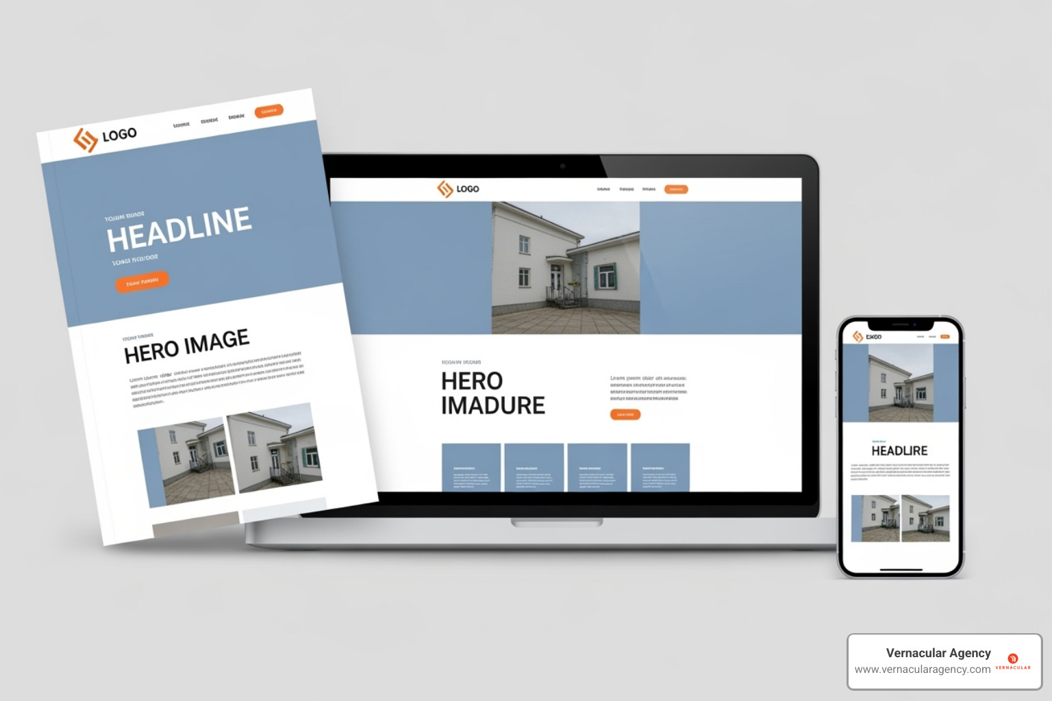
Your logo must be versatile. A beautiful, complex design is useless if it becomes an illegible blur when scaled down for a social media avatar or costs a fortune to reproduce on marketing materials.
The Process of Logo Design for Architects
Creating a logo for your architectural firm is a strategic journey that balances current design trends with timeless appeal. Think of it like designing a building: you want something that fits today's needs while standing strong for decades.
Current logo design for architects trends include minimalism, with clean lines mirroring uncluttered spaces, and line art or geometric abstraction, which use precise forms to hint at technical skill without being overly literal.
However, trends change. What matters more is creating a versatile logo that works everywhere. In our mobile-first world, your logo must look sharp on a smartphone screen, a business card, and a billboard.
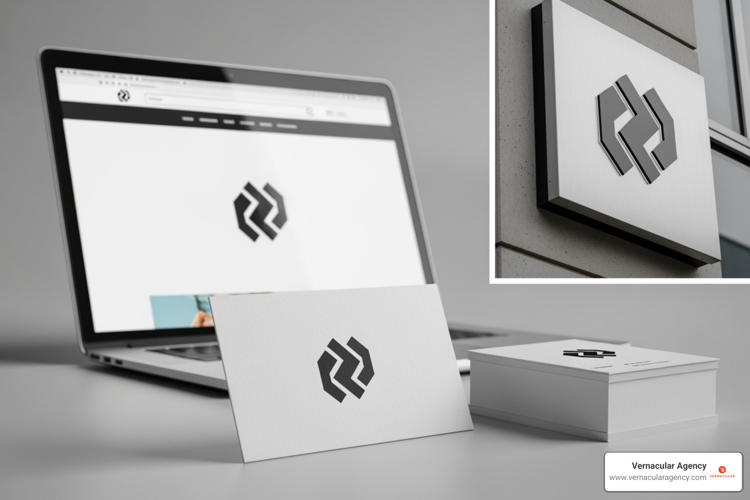
Versatility is non-negotiable. Your logo will live on everything from blueprints to websites. This is why vector files (PDF, SVG) are essential—they allow your logo to scale infinitely without losing quality. A great logo is designed not just for today, but for platforms and materials that don't even exist yet.
Find Vernacular Agency's Content Creation & Creative Direction services
Ensuring Your Logo is Versatile and Timeless
A great logo is a workhorse that performs beautifully in any context. To ensure this, start with the one-color test. If your logo doesn't work in a single color, it's not truly versatile, as it won't work for applications like embroidery or embossing. A strong black and white version is also crucial to see if the design relies too heavily on color for impact.
Consider digital versus print applications. A color that pops on a screen (RGB) may look different in print (CMYK). Ensure you have the right file formats for every use case. Most importantly, avoid overly trendy elements that will quickly date your brand. Classic forms and timeless typography will serve you far better than a passing fad.
Common Pitfalls to Avoid in Logo Design for Architects
Even with the best intentions, it's easy to fall into common traps. Avoid these mistakes:
- Overly complex designs: A logo should pique interest, not tell your whole story. If it's not simple enough to be memorable, it's too complicated.
- Poor font choices: Stick to one or two readable typefaces. A logo that can't be easily read is ineffective, especially at small sizes.
- Clashing colors: Use a limited, harmonious color palette that improves readability rather than hindering it.
- Scalability issues: Your logo must be designed in a vector format (like SVG or PDF) to scale perfectly for any application, from a tiny favicon to large signage.
- Generic icons: Using stock images of houses or blueprints makes you blend in. Your logo should be unique to your firm to ensure you stand out.
A well-designed logo is an investment in your firm's future success, and these pitfalls are avoidable with thoughtful planning and professional guidance.
Building Your Logo: Choosing the Right Approach
Creating a logo for your architectural firm is a foundational decision. While online logo makers and templates may seem tempting for their speed and low initial cost, this approach often comes with significant drawbacks. Template-based designs risk looking generic, failing to differentiate your firm in a competitive market. More importantly, they lack the strategic thinking required to create a symbol that truly connects with your ideal clients and reflects your unique architectural philosophy. A logo created without this strategic foundation may require a costly redesign much sooner than anticipated as your firm grows.
When you're serious about building a brand that lasts, investing in professional design transforms the entire process. It shifts the focus from simply picking colors and fonts to a strategic exploration of your firm's identity.
At Vernacular Agency, we start every logo design for architects project by digging deep into your firm's story. What makes you different? Who are your ideal clients? What values drive your work? This strategic foundation ensures your logo doesn't just look good—it works hard for your business.
The benefits of this professional approach include:
- Custom Design: Your logo will be entirely yours. No templates, no risk of seeing a similar design on a competitor's truck. We create something that captures your unique approach to architecture.
- Industry Expertise: We understand that architectural clients value precision, creativity, and professionalism. We know which visual cues build trust with homeowners versus commercial developers. This knowledge shapes every design decision.
- Brand Consistency: We provide comprehensive guidelines to ensure your visual identity works perfectly across business cards, websites, project signage, and social media, reinforcing your professionalism at every touchpoint.
- Long-Term Value: A well-designed logo grows with your firm, avoiding the cost and confusion of frequent redesigns. It becomes a genuine asset that builds brand recognition in your community.
Working with our team means you're not just getting a logo—you're getting a strategic partner who understands both design and business. We've helped architectural firms across Maine and beyond create identities that truly represent their vision and attract their ideal clients. Because at the end of the day, your logo should work as hard as you do.
Conclusion
Creating a strong logo design for architects is like laying the cornerstone of a beautiful building - it sets the foundation for everything that follows. We've explored how the right logo becomes far more than just a pretty symbol. It's your brand's visual blueprint, the first handshake with potential clients, and the consistent thread that weaves through every marketing touchpoint.
Think back to those five key principles we discussed: simplicity that cuts through the noise, memorability that sticks in clients' minds, timeless design that won't look dated in five years, versatility that works everywhere from business cards to building signage, and appropriateness that truly reflects your firm's unique personality. These aren't just design buzzwords - they're the building blocks of a logo that actually works for your business.
The colors you choose matter deeply. Professional grey conveys stability and sophistication, while trustworthy blue communicates reliability and intelligence. Your typography speaks volumes too, whether you lean toward clean sans-serif fonts for a modern feel or neat serif typefaces for a more traditional approach. Every design choice sends a message about who you are as an architect.
We've seen how a thoughtfully crafted logo boosts your entire marketing strategy. It builds brand awareness, creates instant credibility, and helps you stand out in a crowded marketplace. Whether you specialize in cozy residential projects or towering commercial developments, your logo should capture that unique vision and communicate it clearly to your ideal clients.
The design process itself requires careful consideration. Your logo needs to perform flawlessly whether it's tiny on a smartphone screen or massive on a construction site banner. It should look just as sharp in black and white as it does in full color. These practical considerations aren't afterthoughts - they're essential for a logo that truly serves your business.
A logo represents a significant investment in your firm's future. It's not just about looking professional today - it's about building a lasting brand that grows with you over the years. When designed strategically, your logo becomes a valuable business asset that pays dividends in client recognition and trust.
At Vernacular Agency, we've helped countless businesses craft brand identities that don't just look beautiful - they work hard for their owners. We understand that logo design for architects requires a special blend of artistic vision and strategic thinking. Your logo needs to reflect the precision and creativity that defines great architecture while speaking directly to the clients you want to attract.
Ready to build a brand identity that truly represents your architectural vision? We're here to guide you through every step of the process, from initial concept to final application.